currently-creating.txt
Last Updated: June 17, 2026

-Currently refining this portfolio.

-Recently switched from oil painting to colored pencils and have become slightly obsessed.

-Documenting the process on TikTok.

-Trying not to collect more hobbies.

Sekolah Bogor Raya

Website Strategy, UX Design & Web Development

Creating Clarity at Scale

I worked with Sekolah Bogor Raya to redesign and migrate the school's website from WordPress to Webflow, creating a more modern and scalable digital experience. My work spanned digital strategy, information architecture, UX/UI design, content strategy, and Webflow development, resulting in a platform that better served prospective families, current parents, students, and staff while giving the school a flexible content management system for long-term growth.
Timeline
4 Month Contract
January 2026 - May 2026
Deliverables
Website Redesign
40+ Pages
CMS Implementation
Tools
Figma · Webflow
The Challenge

The existing website had grown organically over time, making it difficult to navigate and maintain. With information spread across dozens of pages and multiple audiences to serve, the redesign focused on creating a clearer information architecture, a more intuitive user experience, and a scalable content management system.
Key Challenges
  • Navigating a website spanning 40+ pages across multiple departments
  • esigning for diverse audiences with different goals and user journeys
  • Improving consistency across navigation, layouts, and visual hierarchy
  • A fragmented content structure that was difficult for internal teams to maintain
Project Goals
  • Simplify navigation through a restructured information architecture
  • Design a cohesive, responsive experience across every page
  • Build a scalable Webflow CMS that simplified content management
  • Improve content discoverability for prospective families, parents, students, and staff
  • Create a digital platform that could evolve alongside the school
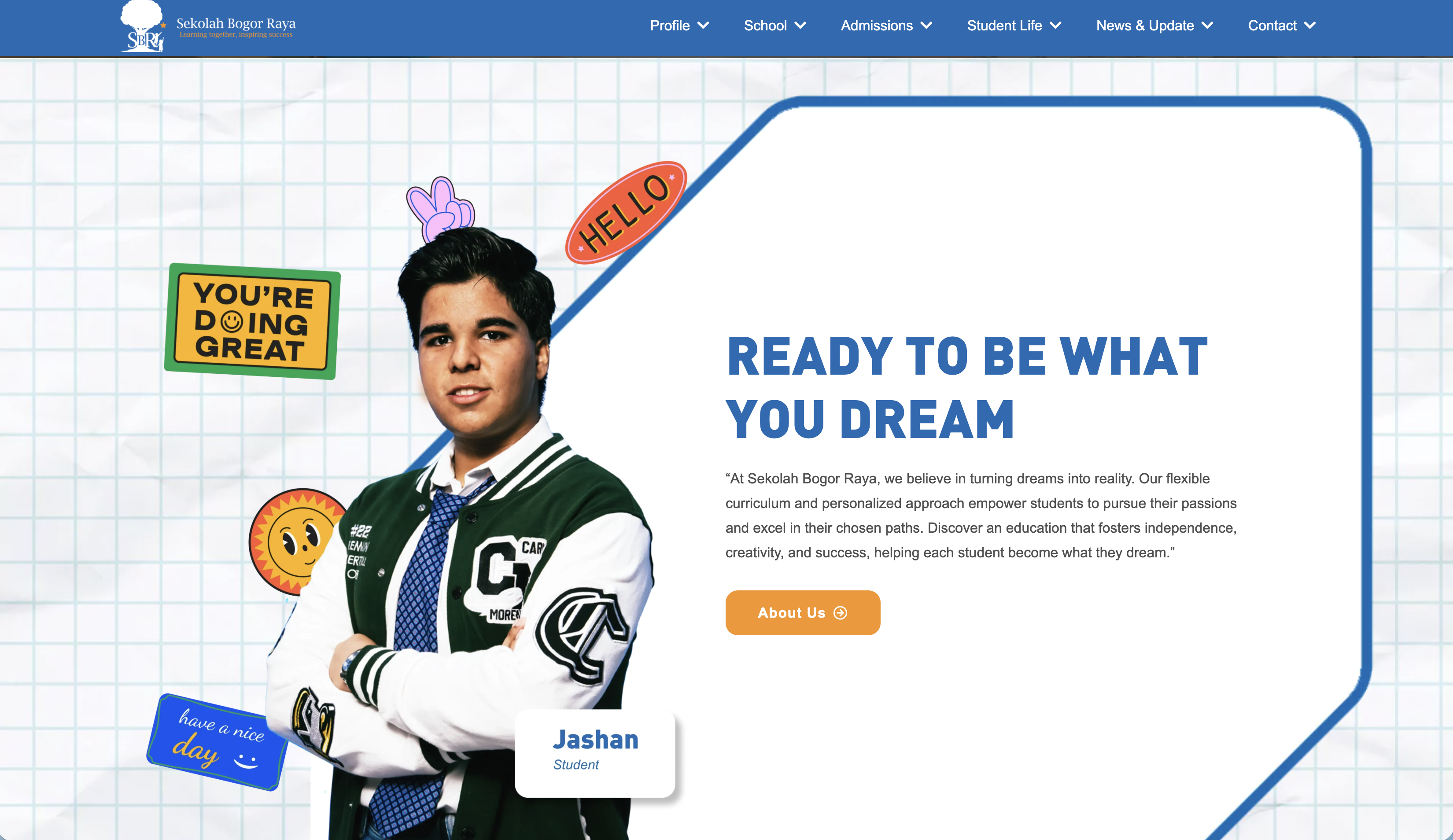
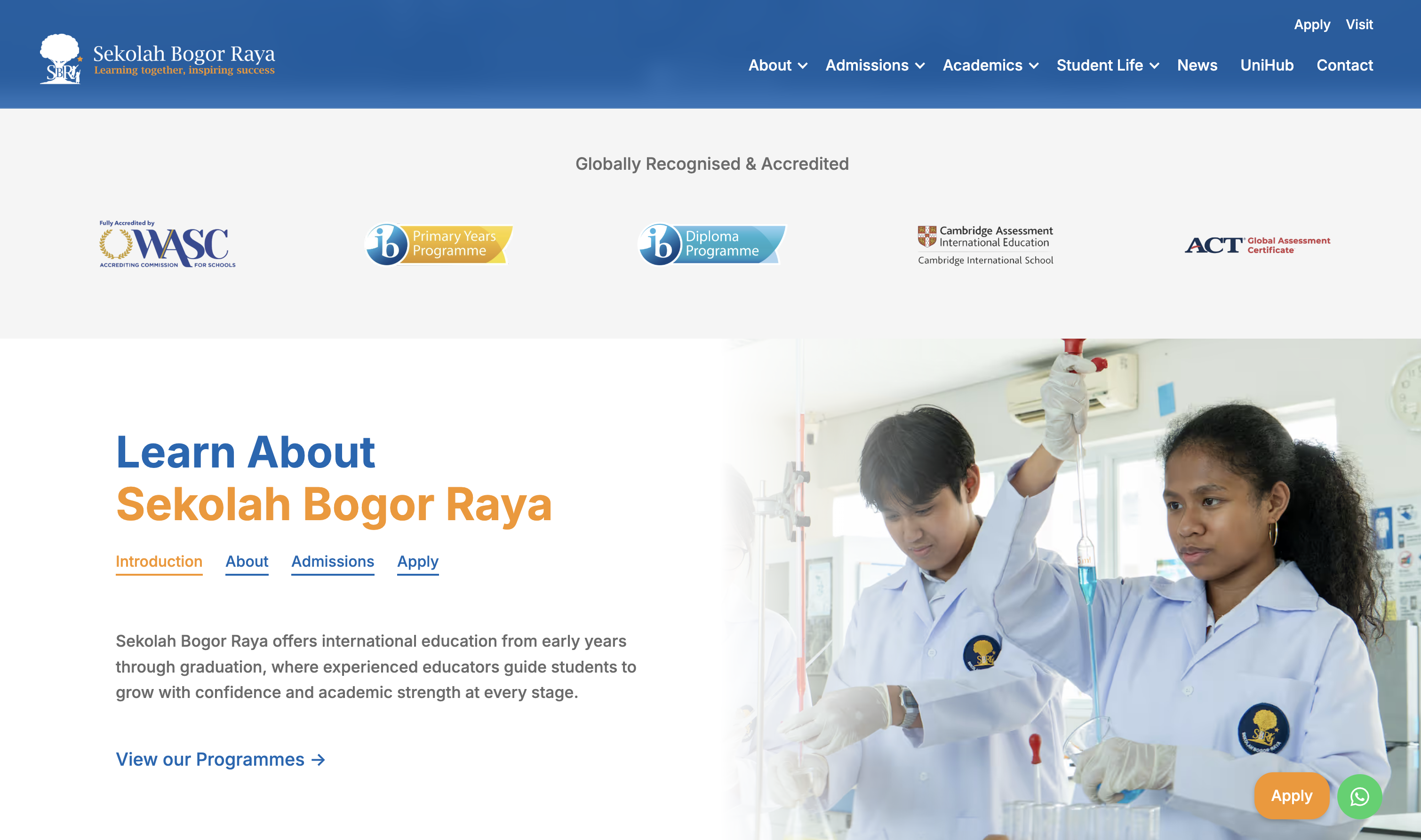
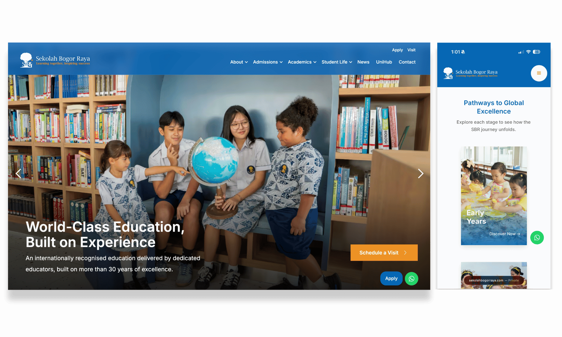
The redesign transformed Sekolah Bogor Raya's website into a more modern and intuitive experience. The comparison below highlights how improvements to layout, visual hierarchy, and navigation created a clearer digital journey for prospective families, parents, students, and staff.
Pre-Revamp (Homepage Content)
Post-Revamp (Homepage Content)

Designing a Scalable Digital Foundation

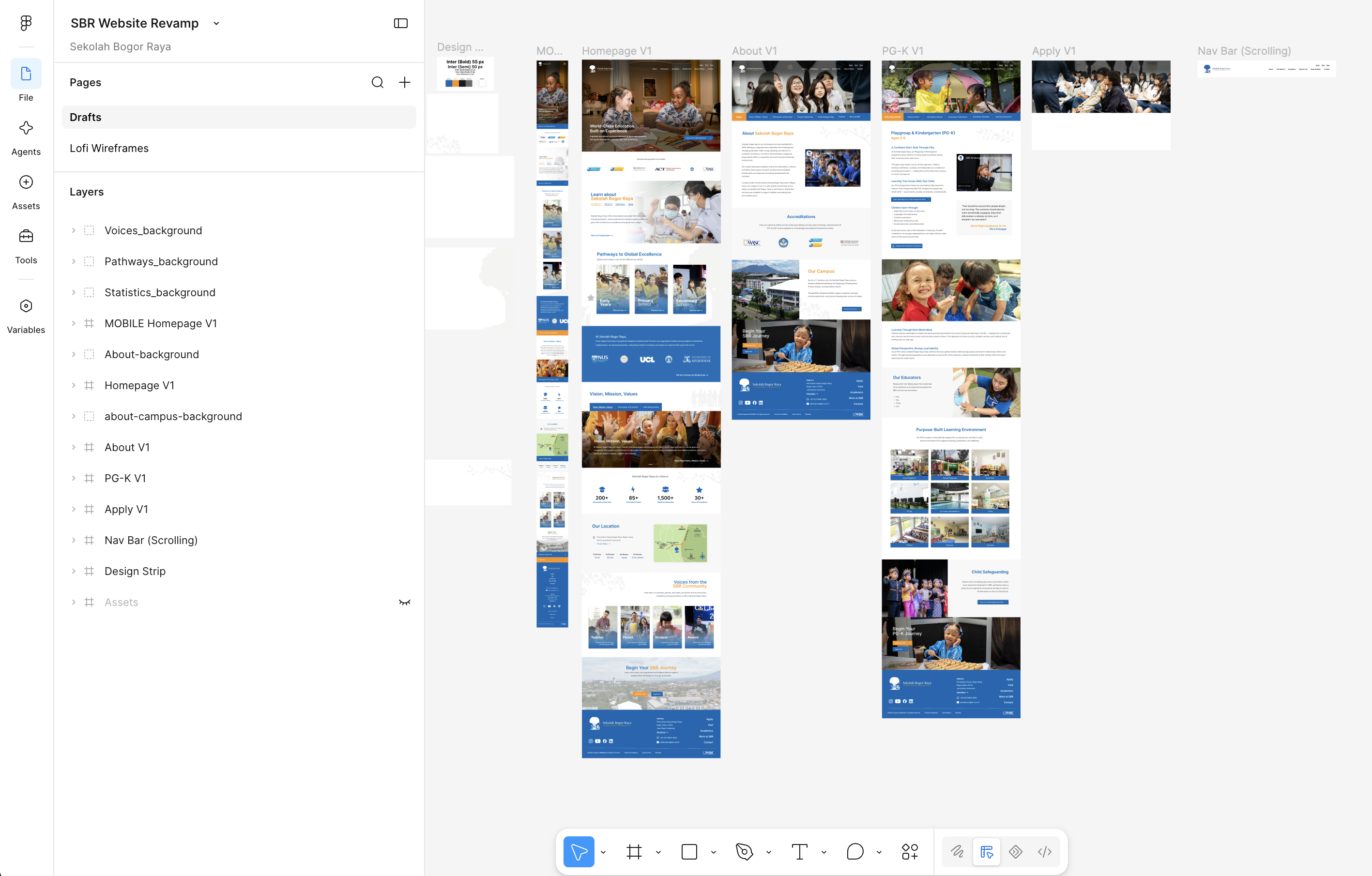
Redesigning Sekolah Bogor Raya's website meant creating a system that could support a growing school community and an expanding body of content. Working in Figma, I restructured the site's information architecture and designed a library of reusable page templates that translated seamlessly into Webflow. The result was a flexible design system that improved consistency across more than 40 pages while making content easier for the school's internal team to manage.

Design Principles

Information Architecture
A clear sitemap and intuitive navigation organized content around the needs of prospective families, parents, students, and staff.
Consistent Systems
Reusable page templates, shared components, and consistent layouts created a cohesive experience across every section of the website.
Built for Growth
A scalable Webflow CMS empowered the school to update and expand content without compromising structure or usability.
UX architecture and modular component system in Figma (V1)
UX Page Design in Figma (V1)

Designing at Scale

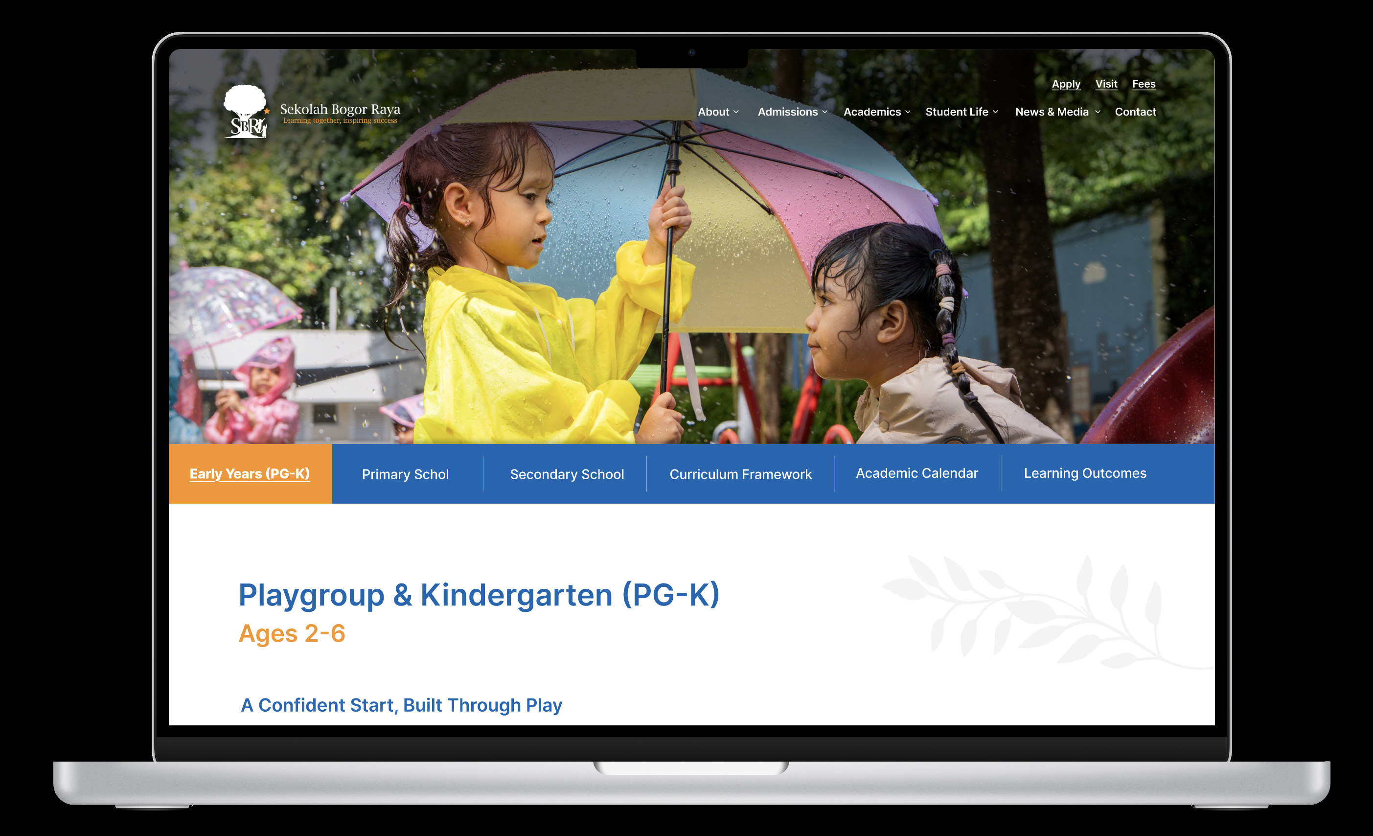
Redesigning Sekolah Bogor Raya extended far beyond the homepage. Every page was reimagined to create a cohesive experience across admissions, academics, student life, and school communications. While each section served a unique purpose, the challenge was maintaining consistency without sacrificing flexibility.

Using a modular design system, I created reusable layouts and components that could adapt to different types of content while preserving a unified visual language. This approach resulted in more than 40 redesigned pages that were intuitive to navigate, scalable to maintain, and consistent across the entire website.

Product System Principles

Modular Templates
Reusable page layouts provided a consistent foundation while accommodating the unique needs of each department and program.
Content-First Design
Every page was structured around clear hierarchy and readability, ensuring information remained accessible across a wide range of content.
Consistency at Scale
Shared components, typography, spacing, and interaction patterns created a unified experience across more than 40 pages.
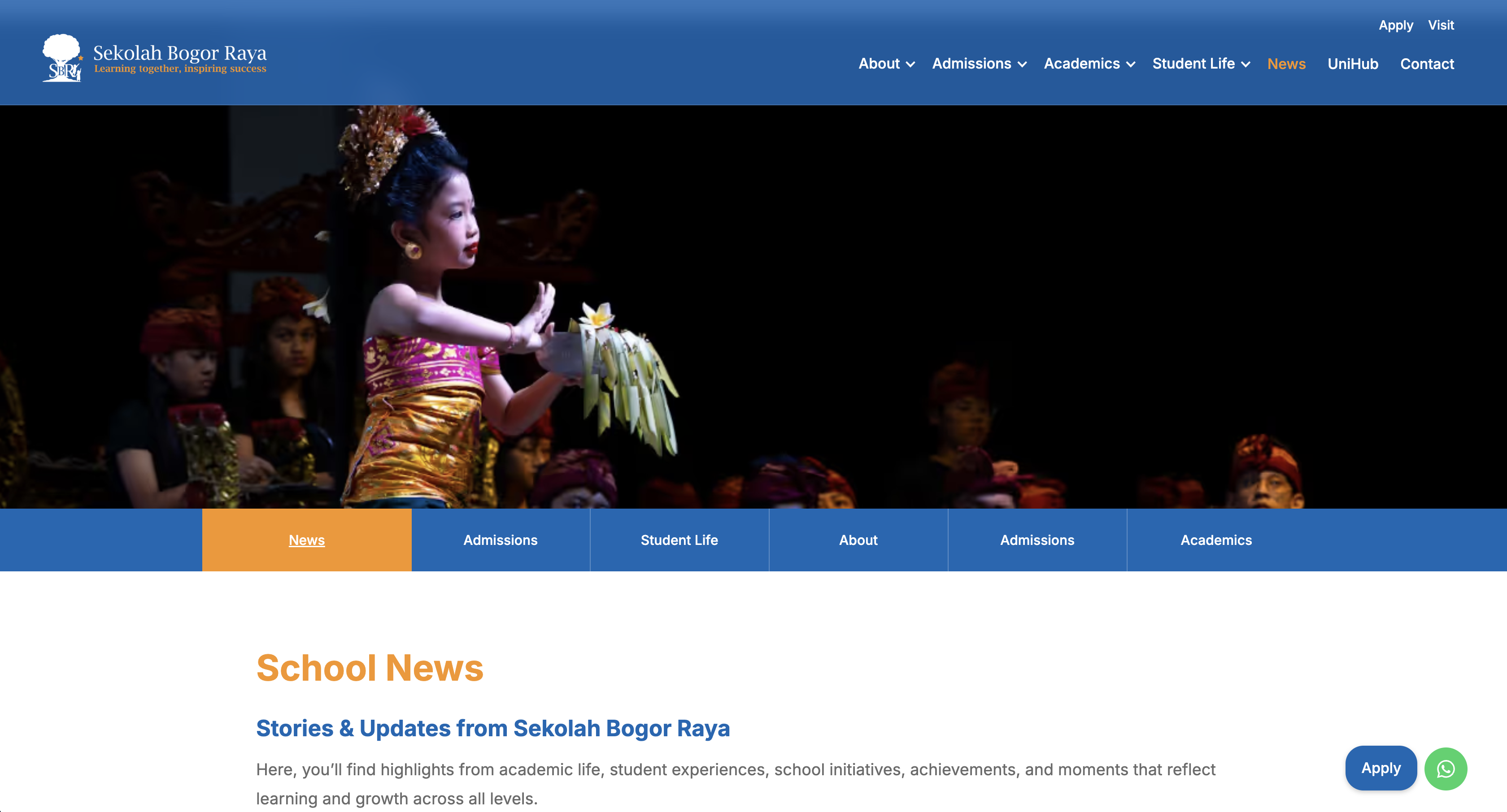
School news hub with reusable content templates
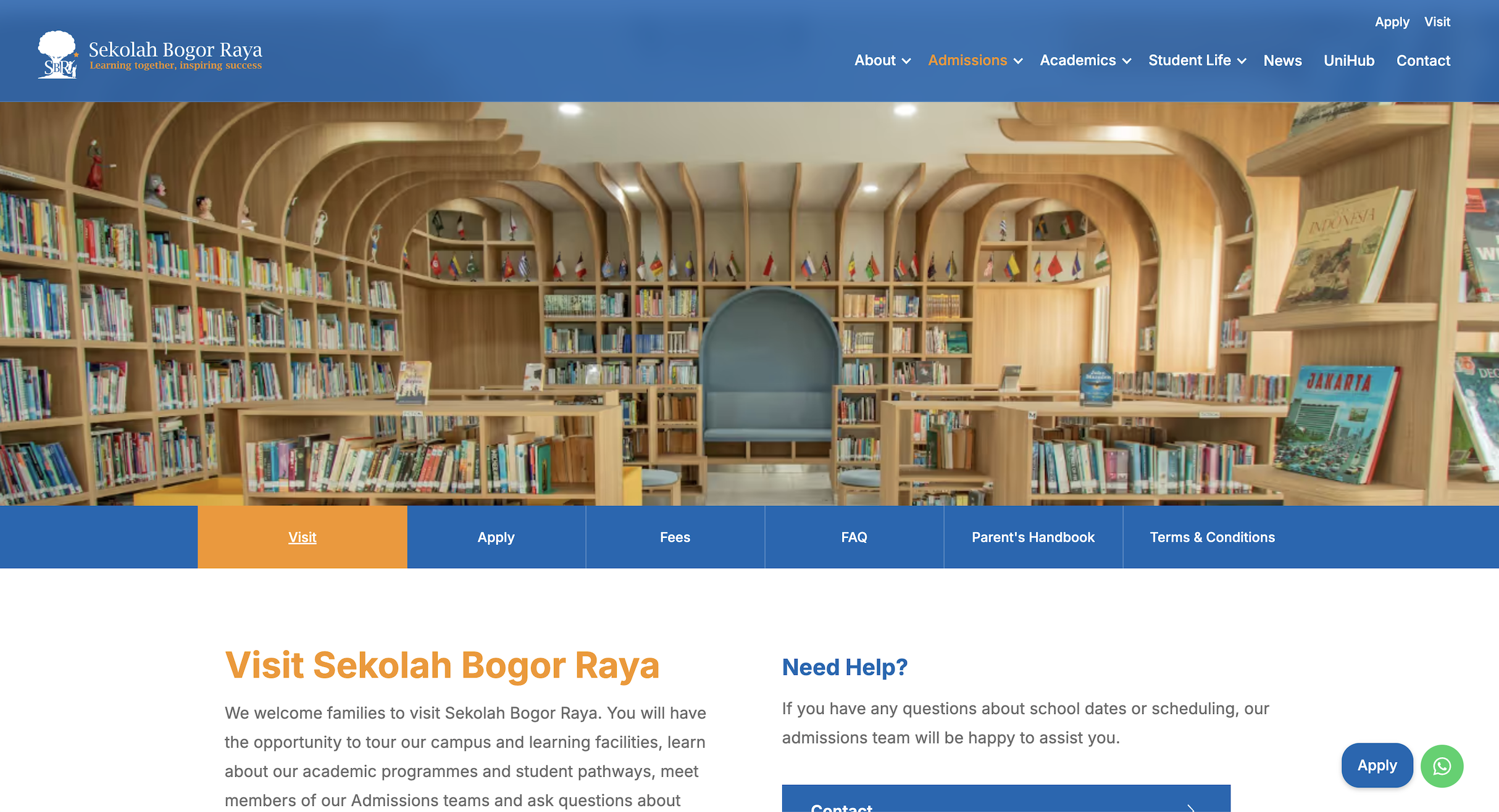
Visit page designed to guide prospective families

Reflection

This project reinforced that designing for large organizations requires more than creating beautiful interfaces. Balancing the needs of prospective families, parents, students, and staff meant every decision had to support clarity, consistency, and long-term maintainability. By combining strategy, UX, and implementation, I created a scalable digital foundation that the school can continue to build on as it grows.
Selected Product Design Projects
Other Mediums