Wakesurf Board Designs
A collection of three custom boards designed in close collaboration with individual clients: from initial concept and creative direction to final production-ready files. Each piece was tailored to their vision and sent to Verve board manufacturing for printing.
Tools used: Procreate, Adobe Illustrator, Adobe Photoshop
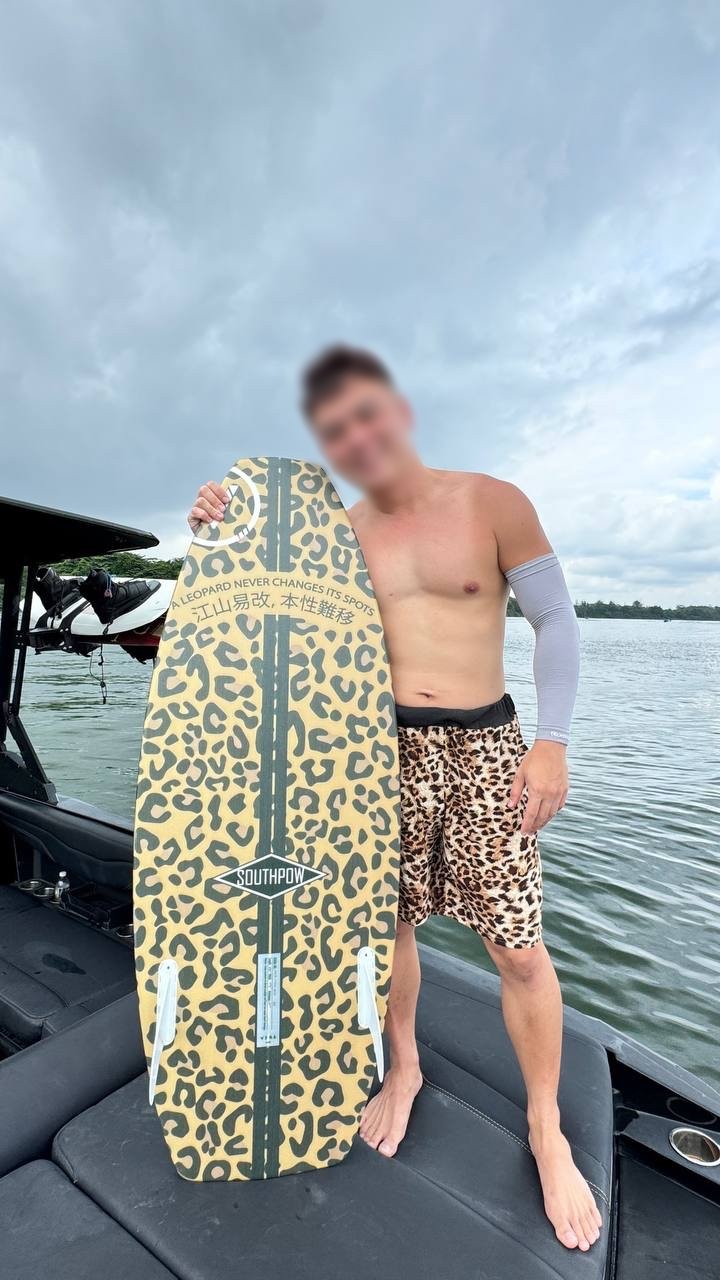
BOARD #1 — LEOPARD

LEOPARD BOARD
💬 Design Notes
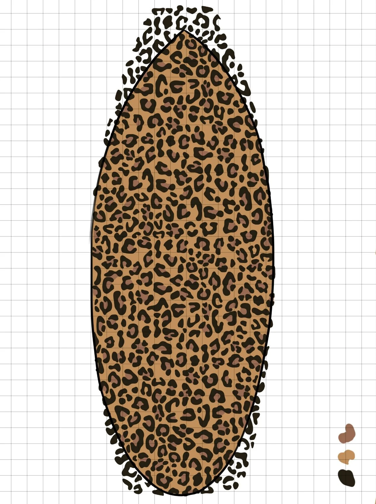
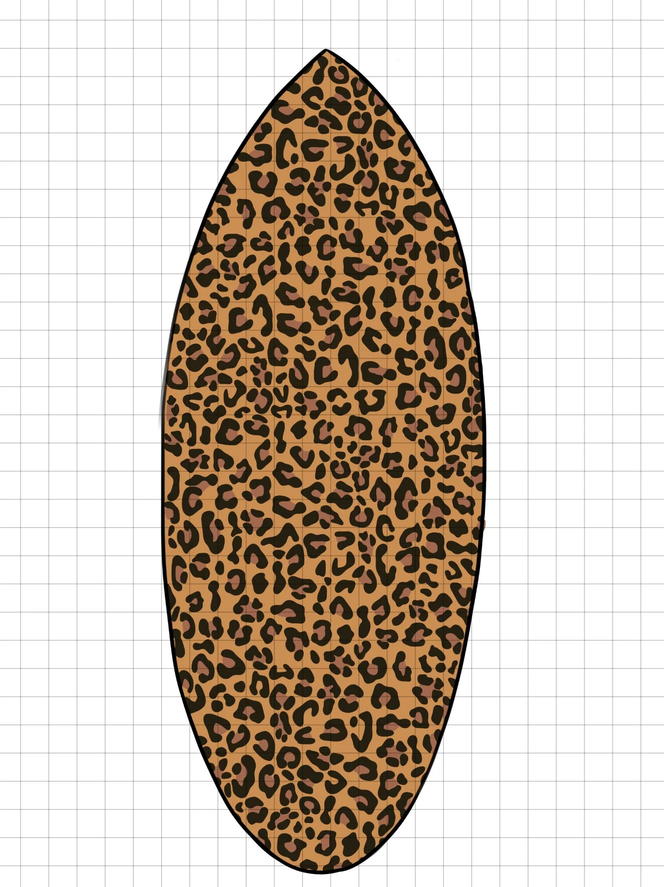
Concept: The client requested an all-over leopard print that felt stylized — realistic in color depth, but not photorealistic. They also wanted the phrase “A leopard never changes its spots” along with the Chinese translation placed cohesively on the board. Placement of the text was flexible, as long as it flowed with the overall layout.
Goal: Develop a pattern with organic variation in spot shape and size. Add visual depth through a range of black and brown tones to give the print dimension. Curve the text to follow the board’s natural shape so it sits harmoniously within the layout.
Process:
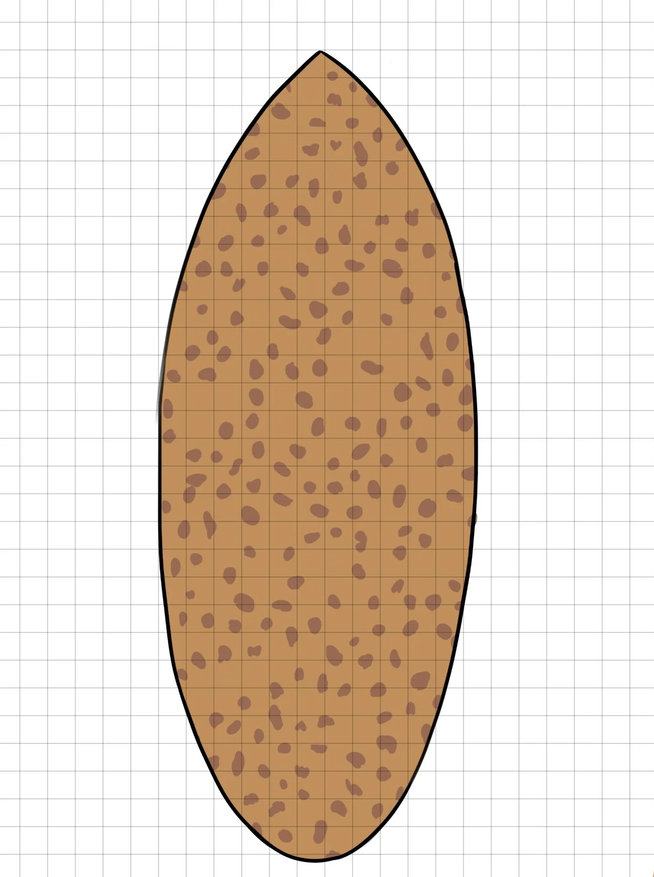
Began in Procreate, hand-drawing each leopard spot in separate layers for easier color control and editing.
Sketched rough board outlines for reference and mocked up two board styles (skim vs. surf) as the client hadn’t finalized their shape.
Imported the design into Adobe Illustrator for vector refinement and scalability.
Aligned final artwork to the manufacturer’s board template to ensure seamless, full-bleed printing on both front and back sides.
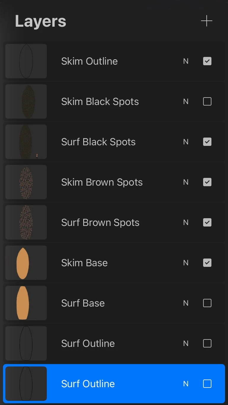
Procreate Process, Layer Organization & Final Product
A glimpse into the early stages of composition. Every spot was hand-drawn and layered by color to allow for seamless editing and future adjustments in Illustrator. This workflow helped maintain precision while still preserving the organic feel of a hand-drawn texture.
BOARD #2 — flames
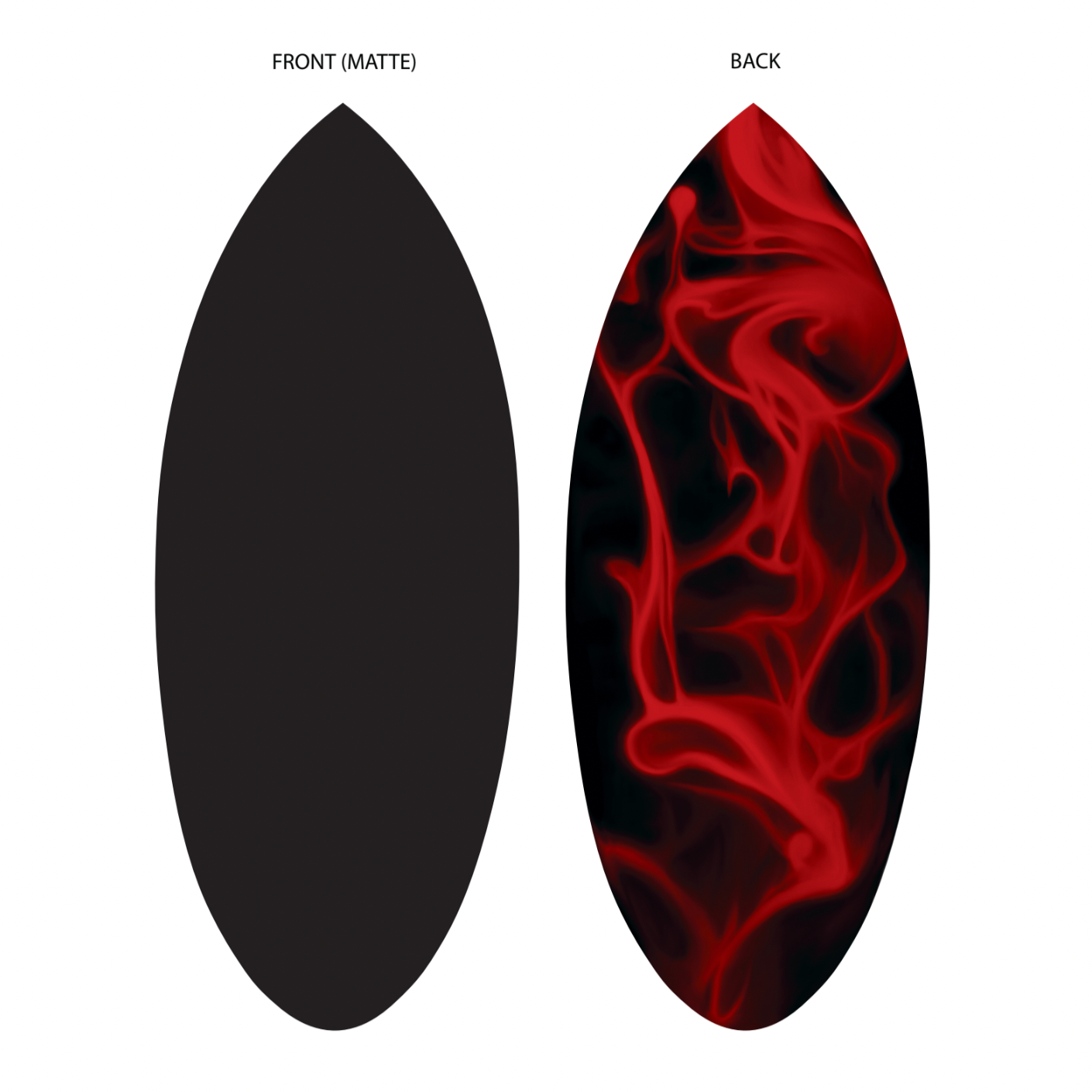
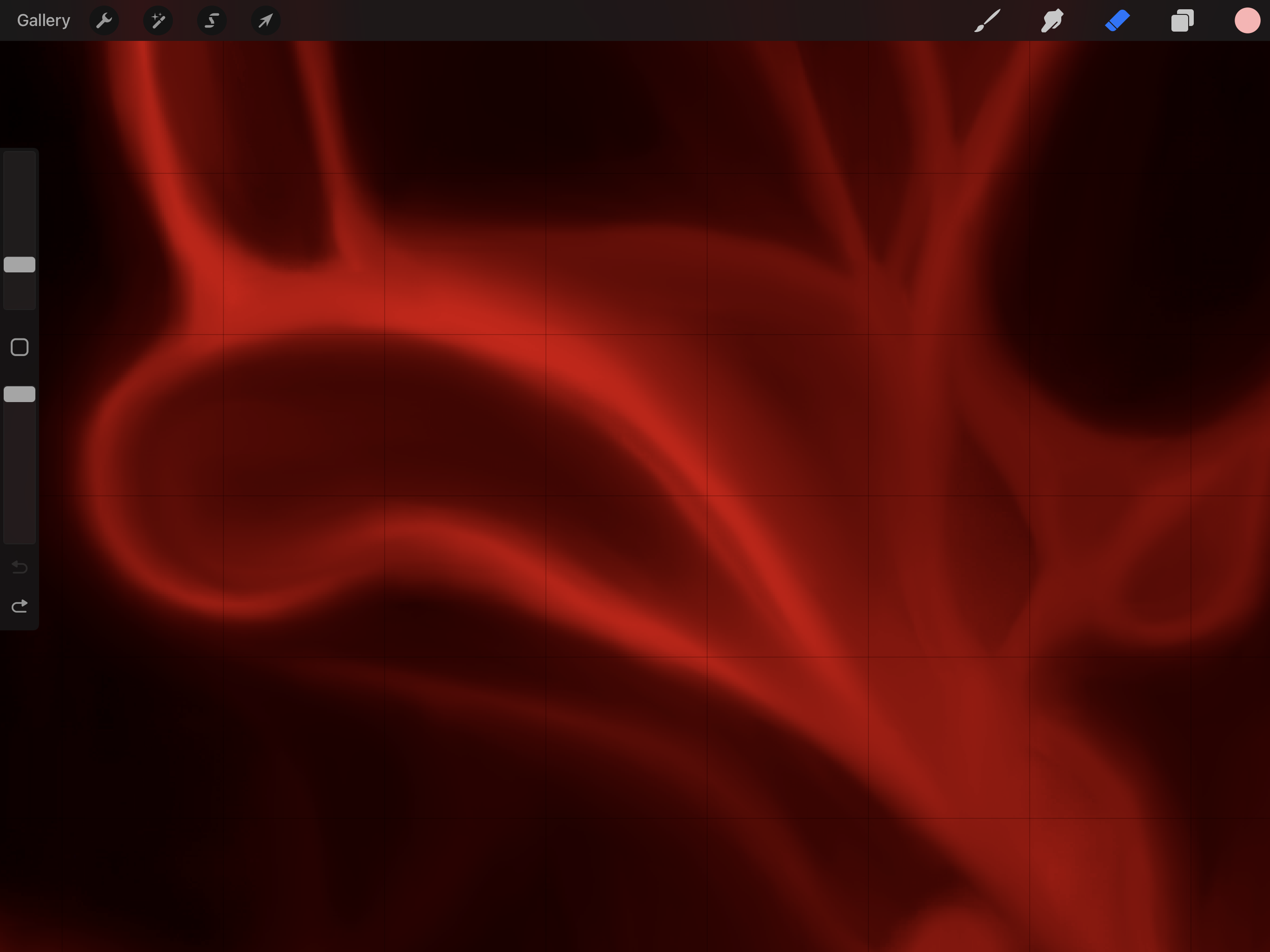
RED FLAMES BOARD
💬 Design Notes:
Concept: The client envisioned a bold red flame motif set against a matte black base. The flames needed to feel stylized, evoking early 2000s aesthetics, while still flowing organically across the surface. On the opposite side, the board was to remain a clean matte black.
Goal:
Create a simplified yet dynamic flame pattern that could be successfully vectorized without losing the visual complexity of the glowing reds. The challenge was achieving dimension and flow without overcomplicating the shapes for print execution.
Process:
Sketched multiple flame designs in Procreate, layering different reds to simulate a glowing, fiery effect.
Shared initial drafts with the client for feedback on flame shape, placement, and intensity, leading to two main revision rounds.
Moved finalized sketch to Adobe Illustrator for clean vectorization, ensuring the pattern could be scaled and printed accurately.
Used Photoshop to reintroduce color depth and brightness that was lost in Illustrator’s flat vector format.
Reimported the revised artwork into Illustrator, applied it to the board manufacturer’s template for final adjustments and scalability.
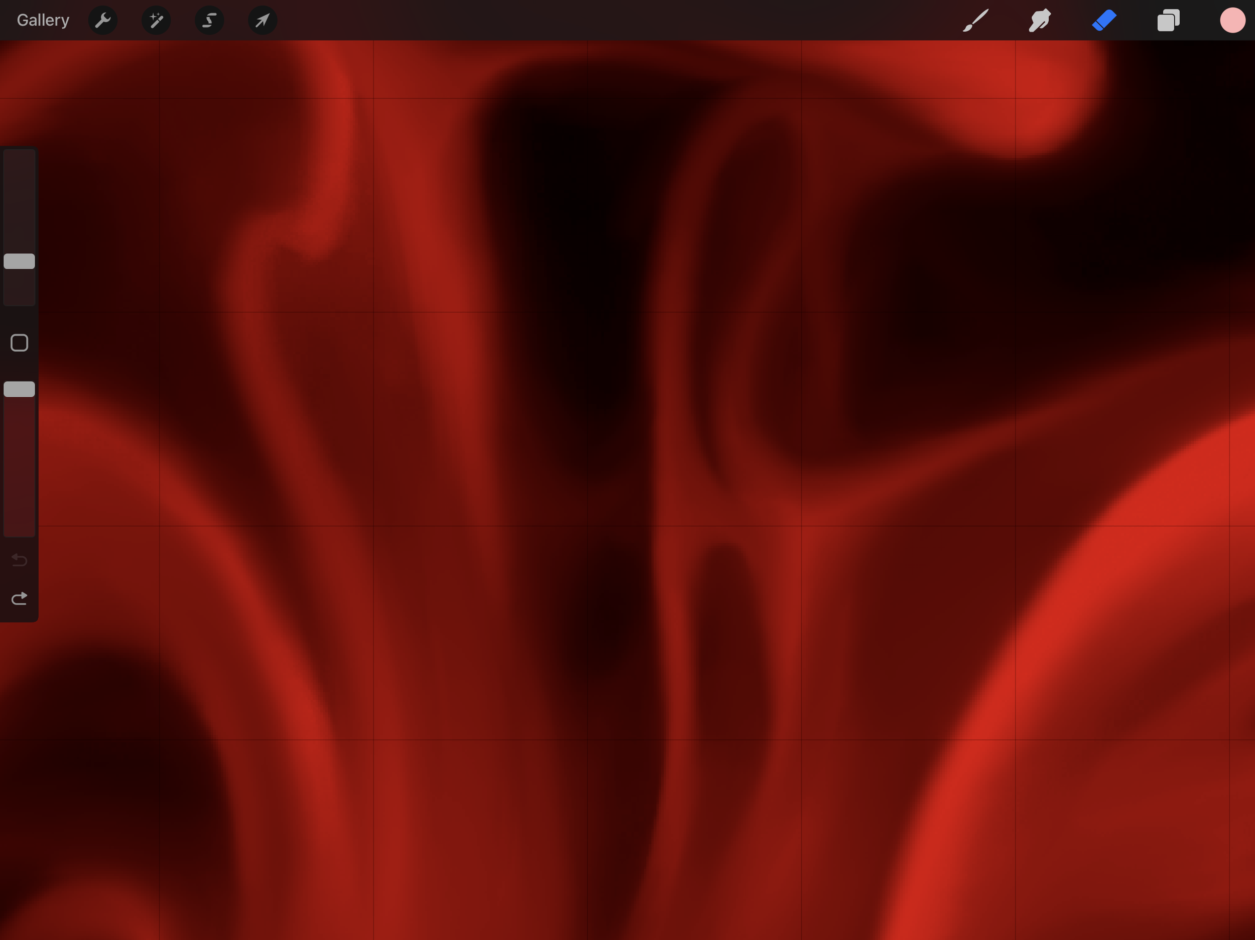
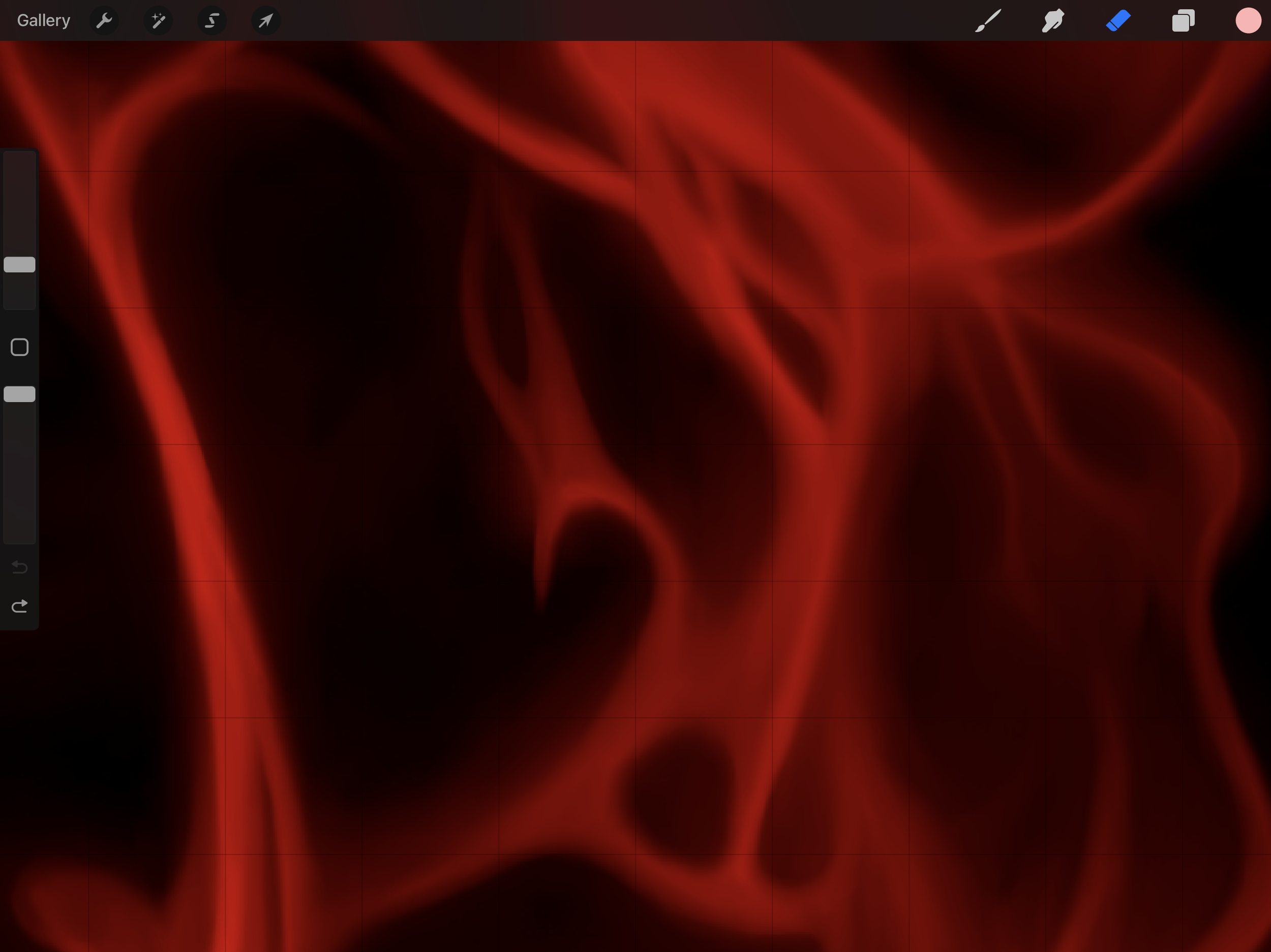
Procreate Close-Ups
Zoomed-in snapshots of the original Procreate file, showing the layering and rendering approach for each individual flame. These highlight how dimension and glow were achieved through color variation and brushwork before the vectorization process.
BOARD #3 — BUTTER
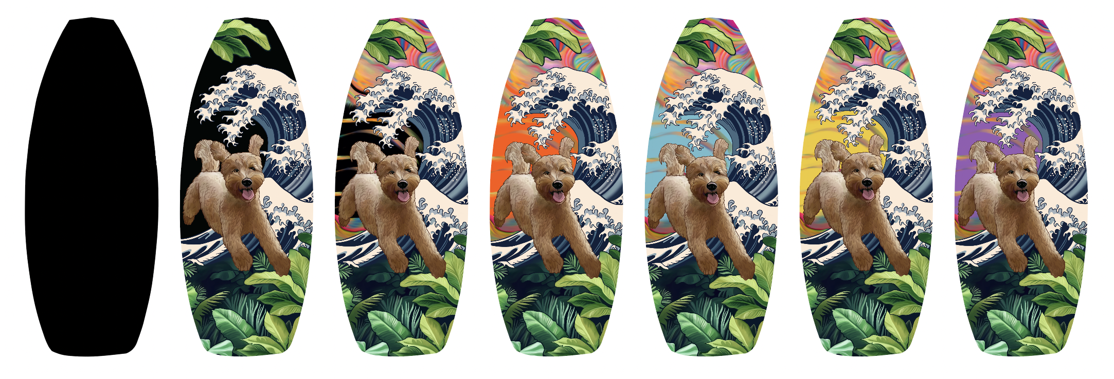
BUTTER & SCENERY BOARD
💬 Design Notes
Concept: Client requested a whimsical scene centered on her dog, Butter, jumping into the frame. She envisioned a rustic aesthetic with a rainbow, ocean waves, leaves, and forest-like greenery. The concept evolved over time, fluctuating between hyperrealistic and animated styles, resulting in multiple design iterations.
Goal: Create a vibrant, balanced composition that integrates Butter as the focal point while weaving in natural elements—waves, leaves, and color—in a way that feels dynamic but cohesive. Maintain a middle ground between realism and stylized illustration.
Process:
Sketched and colored individual elements in Procreate, each on its own layer for flexibility.
Iterated heavily with the client, refining style and layout based on feedback.
Balanced scale and placement of Butter, rainbow, and foliage for visual flow.
Imported finalized illustration into Adobe Illustrator for precise vectorization and printer-ready formatting.
Focused on scalability while preserving hand-drawn charm and complexity.