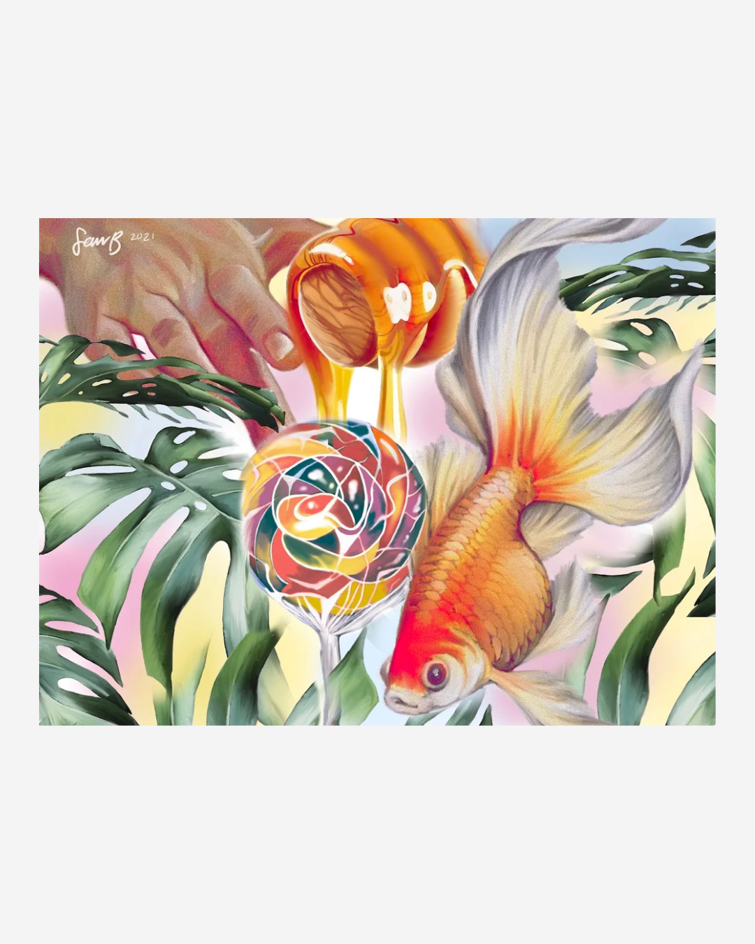
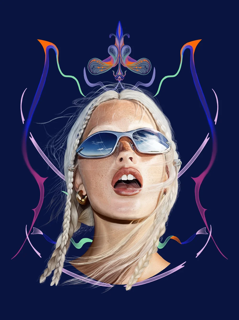
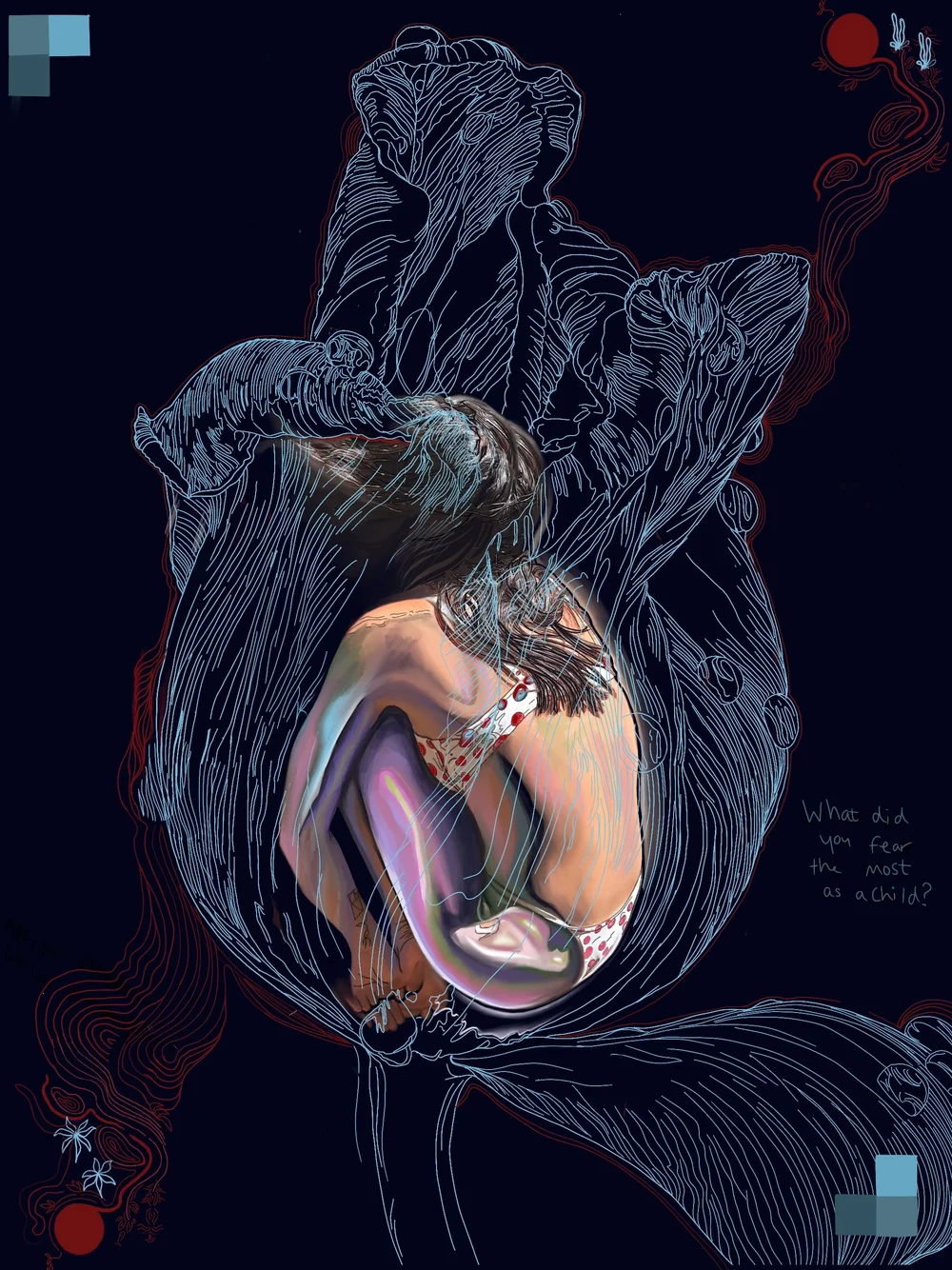
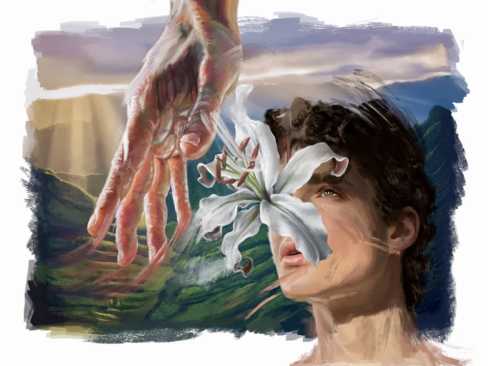
Charles, 2021
Digital illustration, Procreate
2048 x 2732 px
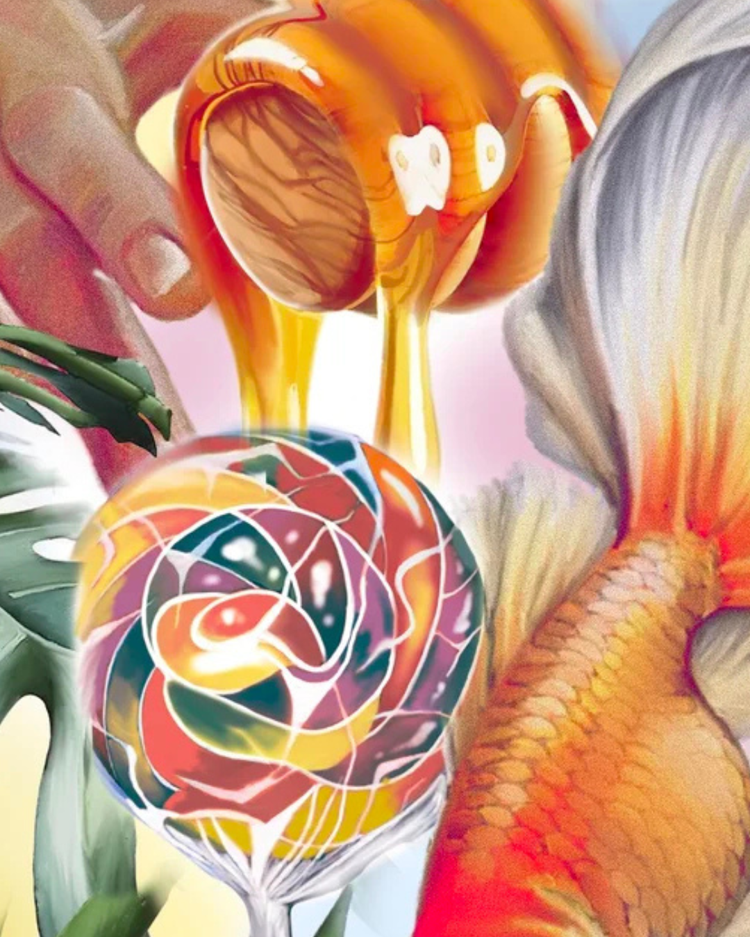
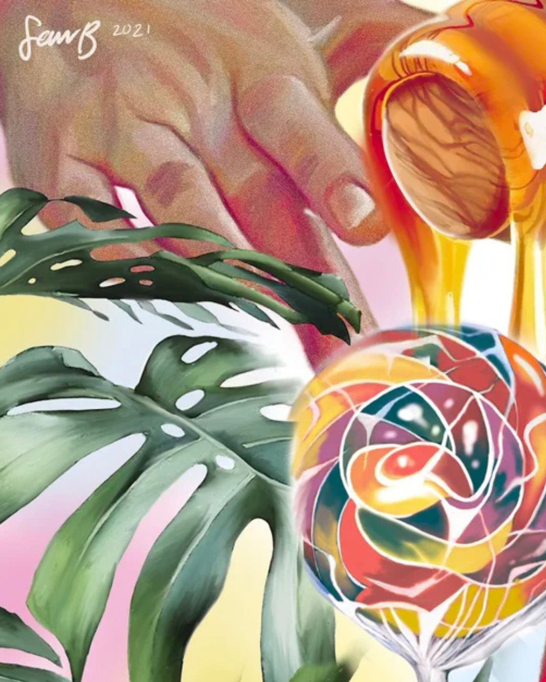
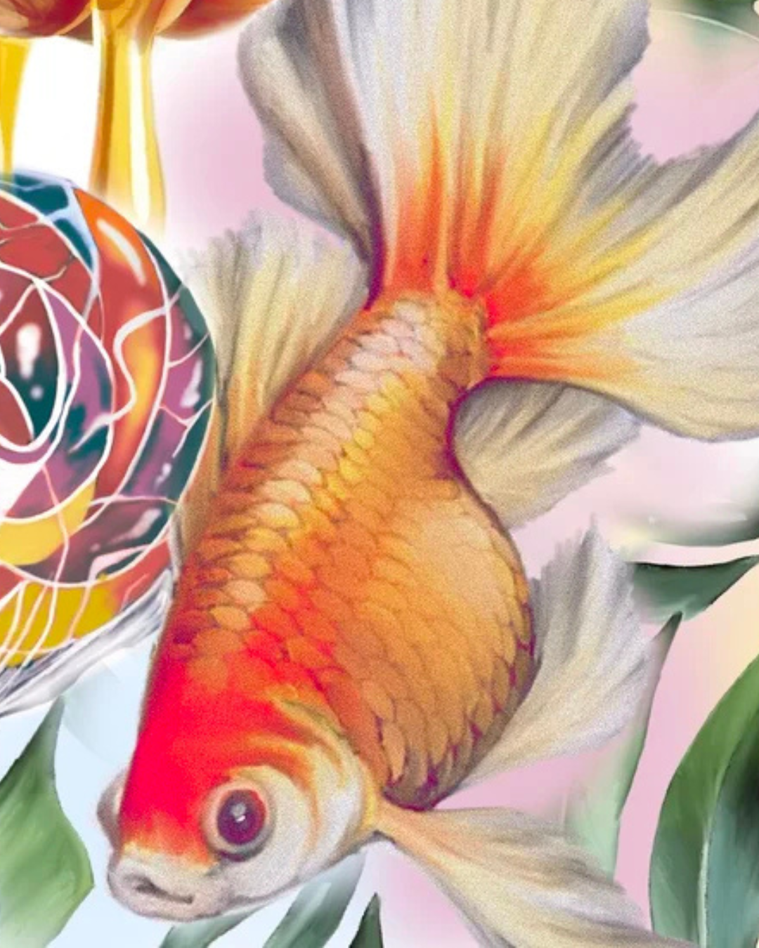
Charles was created as a birthday gift for a close friend, combining a comic-inspired, pop art direction with personal symbolism. Goldfish, a lollipop, honey drips, and monstera leaves reference inside jokes between us, brought together in a playful, surreal composition.
More about the artwork